by Lee Wayland | Apr 6, 2016
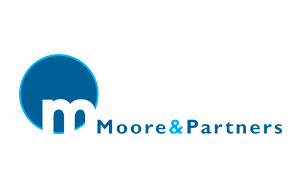
MOORE AND PARTNERS As a new Estate Agent requiring a logo that looked established was a great design challenge for LW design. After working through the design process; trying various colours, shapes and fonts, the above logo design was chosen to be the brand of Moore...

by Lee Wayland | Apr 6, 2016
IWIRELESS SOLUTIONS iWireless Solutions commissioned LW design to create the logo, as shown on the right. The brief was to retain some features of the original in-house logo design, but to move the logo forward to create a more professional image. The logo represents...
by Lee Wayland | Apr 6, 2016
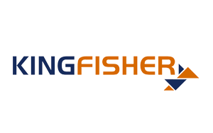
KINGFISHER ASSOCIATES Kingfisher Associates commissioned LW design to modernise their existing logo. Kingfisher logo could easily be associated with the Indian beer. We had to choose a pleasing font and look to create an icon with elements to be carried through other...
by Lee Wayland | Apr 6, 2016
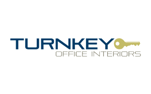
TURNKEY OFFICE INTERIORS TOIL had a logo that was overly complex, so LW design simplified the logo whilst modernising the companies brand identity. The colours were selected from the existing image used to promote the company. LW design also reworked the TOIL website...
by Lee Wayland | Apr 6, 2016
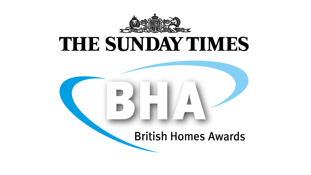
BRITISH HOMES AWARDS Although LW design didn’t produce the original logo, we have been working with and adapting the logo for each new British Homes Awards award year. There are numerous sponsors, partners and dates to edit that have to interact with the basic logo,...
Recent Comments