by Lee Wayland | Apr 6, 2016
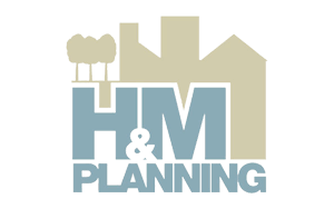
H&M PLANNING H&M Planning were a new company looking for a contemporary logo to lead the rest of their future branding. Neutral colours were chosen, to show consideration when addressing planning constraints. The idea of intersecting the lettering with the...
by Lee Wayland | Apr 6, 2016
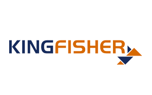
KINGFISHER ASSOCIATES Kingfisher Associates commissioned LW design to modernise their existing logo. Kingfisher logo could easily be associated with the Indian beer. We had to choose a pleasing font and look to create an icon with elements to be carried through other...
by Lee Wayland | Apr 6, 2016
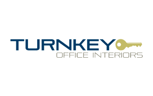
TURNKEY OFFICE INTERIORS TOIL had a logo that was overly complex, so LW design simplified the logo whilst modernising the companies brand identity. The colours were selected from the existing image used to promote the company. LW design also reworked the TOIL website...
by Lee Wayland | Apr 6, 2016
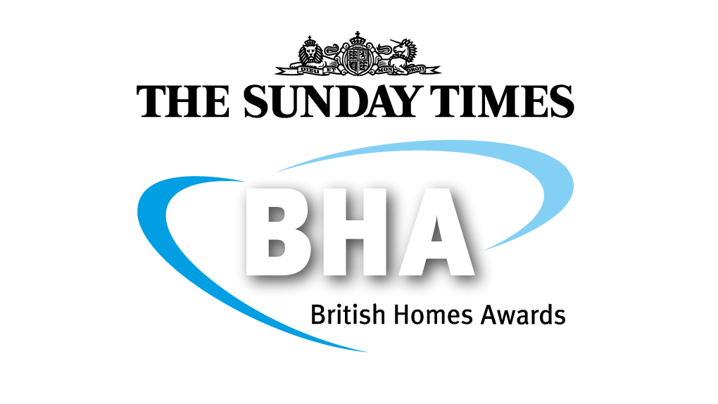
BRITISH HOMES AWARDS Although LW design didn’t produce the original logo, we have been working with and adapting the logo for each new British Homes Awards award year. There are numerous sponsors, partners and dates to edit that have to interact with the basic logo,...
by Lee Wayland | Apr 6, 2016
LANDWAY CONSTRUCTION Landway Construction needed a strong logo to reflect the business sector they occupy. The name is a simple reworking of the directors surname ‘Wayland‘. The black and yellow logo is bold and recognised within the building trade. The Landway...
Recent Comments